
The Blend.
The problem
Upscale wellness and nutrition club, Daytona Beach, FL. Website, digital and physical menus, and product photography.
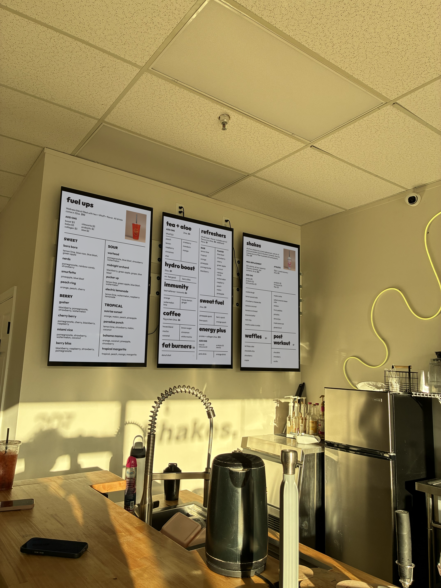
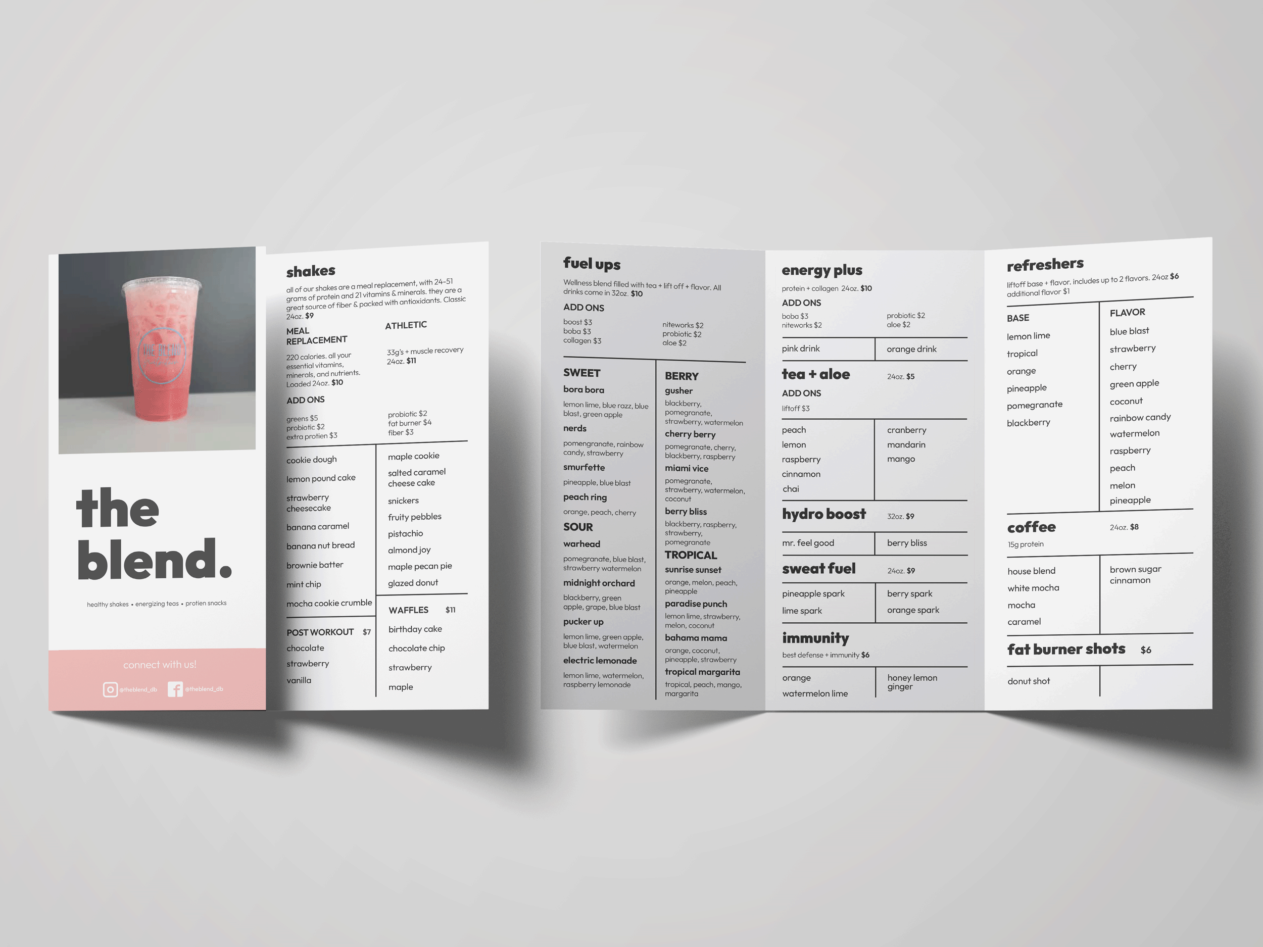
The Blend makes teas, shakes, and waffles that customers come back for, but the experience of ordering didn't match the product. The only menu was on in-store screens that were hard to read, with no clear structure, so customers had to scan from a distance and ask questions to decide. There was no printed menu and no product photography. Online, the website was bare. The quality was in the cup, but nothing in front of the customer showed it.
The diagnosis
In a shop like this, the menu is the main sales tool. It's what a customer reads while they decide, and it either makes the choice easy or slows down the line. So the job started with organizing the offer so it could be read in seconds, then giving the drinks the photography they deserved, in the shop and online.
What I delivered
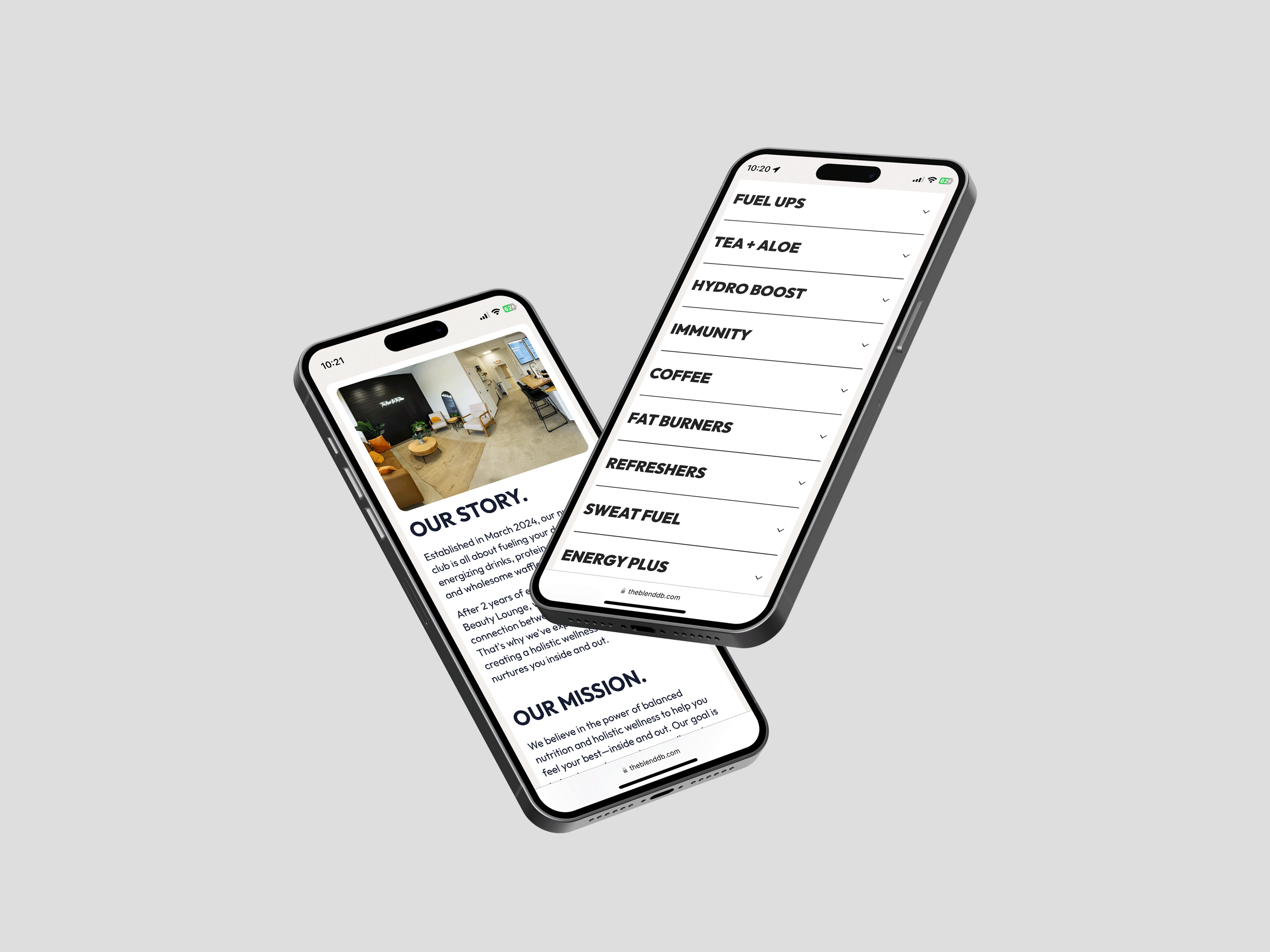
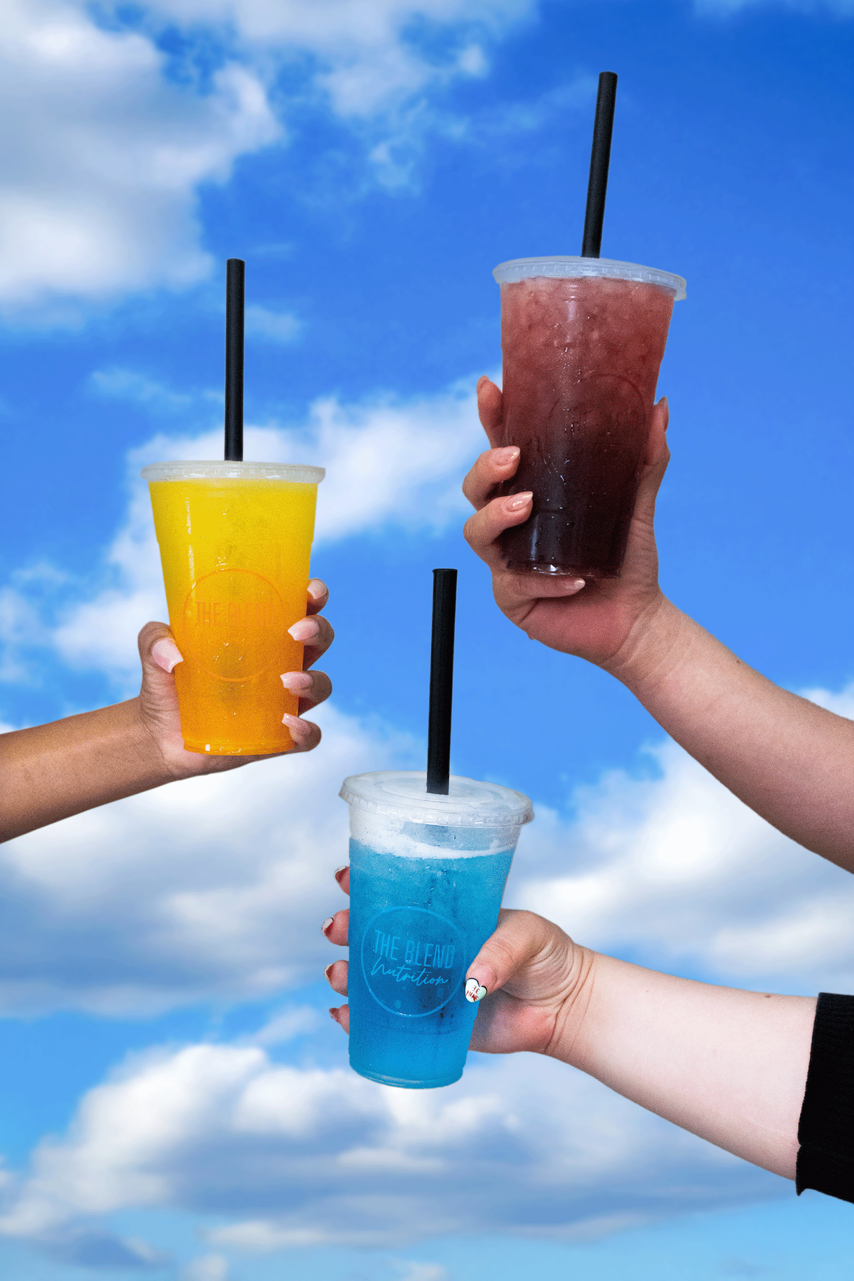
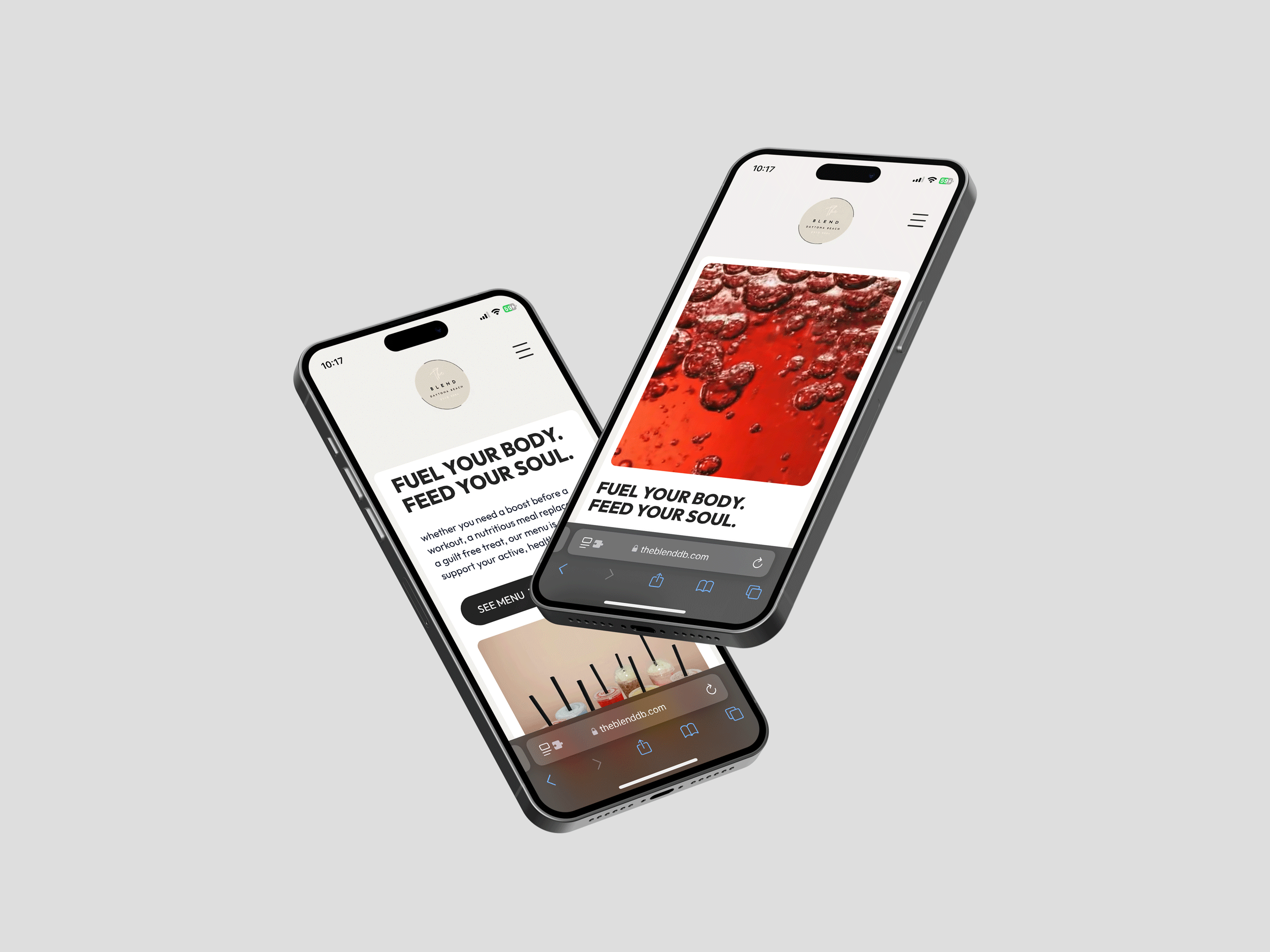
A digital menu system for the in-store screens, with products sorted into clear categories and a structure a customer can read at a glance. A printed menu customers can hold and browse up close. A redesigned website on Wix, so the team can update it themselves, carrying the same look and photos as the shop. Product photography that shows the texture and color of each drink, used across the menus and the site.
Customers now find what they want on the menu with fewer questions, which I saw firsthand before and after the change. The Blend's brand is consistent from the screens in the shop to the website, and the menus and photography are still in daily use.